Tuesday, November 28, 2017

Assignment 10: Sandbox Survey part 2: Visualizing and refining your terrain survey.

Introduction:

In this assignment students will be continuing a Sandbox Survey that started earlier in the semester. The goals for that assignment were to create a ridges, hills, depression, and valleys in the sand. Then construct a 115 by 115 centimeter grid with 5 centimeter intervals for each X and Y value. A Z field was also needed to be measured in order to obtain elevation from the datum. The data was later normalized in Microsoft Excel.Now that all the data has been collected, it is time to make maps and 3-D models out if it. Different Spatial Interpolation methods will use the  X, Y, and Z field in order to achieve the final products.  By using ArcMap and ArcScene  2-D and 3-D maps will be creating using these specific Interpolation tools:
  • IDW
  • Kriging
  • Natural Neighbor
  • Spline
  • TIN
Methods: 

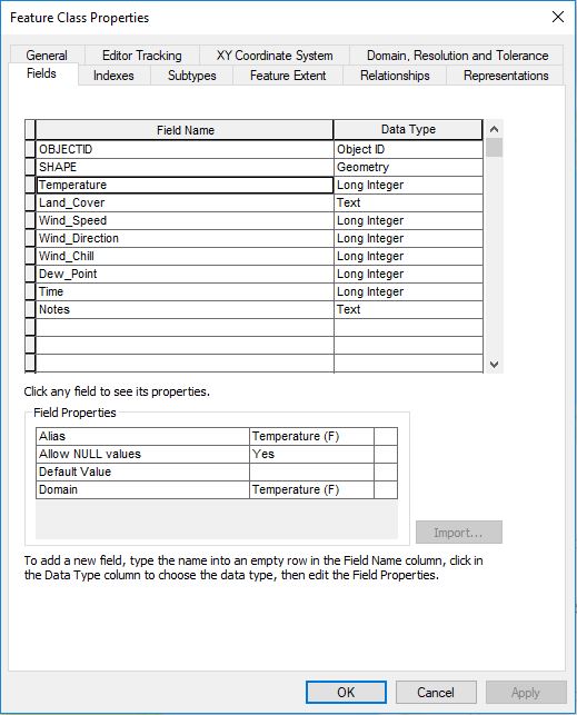
To begin, bring in the X, Y, and Z data recordings in to arc map through and X, Y, and Z field shown in Figure 1 below.

Figure 1. Add XY Data Window
Once the XYZ grid is brought in, a 2-D dotted grid will appear, with all the data that was manually entered in a Microsoft Excel document.

Figure 2. XY Grid
After you create the layer, export it as a feature class. From there you can use different interpolation tools in order to show the data from X, Y, and Z fields.

The first tool used was the IDW tool. To get to this tool, navigate through the arctoolbox to 3-D analysist tools --> Raster Interpolation --> and then IDW. This tool interpolates a raster image from given coordinates using an inverse distance weighted (IDW) method.The farther a sample point is from the cell being evaluated, the less weight it has in the calculation of the cell's value (ESRI, 2017).

The second tool utilized was the Kriging tool. This interpolation method weighs out the collected values to create a predicted value for an unmeasured location according to distance between each point, the prediction locations, and the spatial arrangement among the measured points. This technique is different from the other techniques in that it is an easy method for characterizing the variance of predictions (ESRI, 2017).

The next tool used was the Natural Neighbor tool. This interpolation technique is for multivariate data in a Delaunay triangulation. Weighted values of the nearest surrounding points in the triangulation help estimate the value for each interpolation point. The points then connect to the closest "natural neighbor" when inserted into the triangulation (ESRI, 2017).

Then try the Spline method. This interpolation tool takes estimated cell values derived from a mathematical function that minimizes overall surface curvature allowing it to create a smooth surface that directly passes through the input points (ESRI, 2017).

The last tool used is the TIN tool. It is still an interpolation method, but is not listed under the Raster Interpolation tools like the rest. This is because it is a vector data structure. It partitions geographic space into contiguous triangles that do not overlap. All vertices for every triangle get sampled data points via x-, y-, and z-values. The points are then connected by lines forming Delaunay triangles. TINs not only store surface models, but they also display them (ESRI, 2017).

Results/Discussion:

Note for each of the following figures, displaying examples of each tool, the vertical exaggeration is doubled compared to the original making it easier to visualize the differences in elevation from the highest to lowest points.

IDW (Figure 3):


Figure 3. IDW Method.
The IDW interpolation method was a solid to show the surface elevation, but the changes from each individual dot on the image is based on the actual measurement. In other words, it doesn't do the best job of smoothing out the in between from each spot.

Kriging (Figure 4):

Figure 4. Kriging Technique.
The Kriging Interpolation did a great job of smoothing out the unmeasured area from each measured point. However, it makes it harder to see the elevation difference for both the peaks and the depressions.

Natural Neighbor (Figure 5):

Figure 5. Natural Neighbor Method.
The natural neighbor map does an excellent job at showing the elevation differences, but it as you can see the surface is more jagged and pointy rather than smooth.

Spline (Figure 6):

Figure 6. Spline Technique
The spline method definitely appears to be the smoothest interpolation method so far. The accuracy of the elevation change minimizes distortion creating an image nearly identical to the original model.

TIN (Figure 7):
Figure 7. TIN Method.
The TIN method aesthetics are rather interesting, but that is not important when it comes to making an accurate visual representation of the Sandbox design. The triangles make the surface too rough, and unrealistic. 

Summary/Conclusions:

In conclusion, Spatial Interpolation is a very useful and interesting tool. The IDW method was probably the least effective method due to its bubbly surface. The TIN and Nearest Neighbor methods accurately represents the elevation, but they're surfaces are too rough. The Kriging method makes a very smooth surface, but lacks in showing proper elevation changes. The Spline method, however, does a great job of showing both a smooth surface and an accurate representation of the elevation change. For that reasons, I have concluded that the Spline method is the most accurate method, and looks the most like the original Sandbox design.


Sources:

https://support.esri.com/en/other-resources/gis-dictionary

Monday, November 6, 2017

Assignment 9: Microclimate of Carson Park

Goals and Background:

For this assignment each student was assigned to create a project dealing using ArcCollector. The goal for this students project was to use ArcCollector to figure out how much of an effect the water has on the atmospheric conditions of the Carson Park Isthmus where recreational areas have been created.

The plan is to record 60 points equally spaced out around Carson Park, and gather data for nine different domains. The domains are:
  • Temperature (F)
  • Land Cover
  • Wind Speed
  • Wind Direction
  • Wind Chill
  • Dew Point (F)
  • Location
  • Time
  • Notes

Study Area:

The study area contains all recreational locations on the Carson Park Isthmus, besides for the Chippewa Valley Museum. The recreational facilities include a football field, two baseball fields, a tennis court, a campsite, a large parking lots, and two parks. Data was collected along the Eastern and Western shorelines as well.


Figure 1. Study Area of the Carson Park Microclimate Project.
Methods:

Data Collection Preparation:

Before going out in the field, one must first create a geodatabase for the project. Use the online tutorial given by Professor Hupy in the instructions to make things go quicker. Open the database properties (Figure 1), and put each variable to be measured under the domain name, and write a brief description of that domain. As you can see in Figure 1, The majority of the factors were long integers, and therefore needed a domain type of Range. Set an appropriate minimum and maximum value for each long integer.

Figure 2. Database Properties window
displaying the Domains tab.

However, the variable Land Cover uses a text field. After looking at aerial imagery via ArcGIS basemaps, classify Land Cover by Trees, Asphalt, Grass, and Aggregate.


Figure 3. Domains tab showing the four coded
values manually entered for Land Cover.

Once all of the Domains are filled out for the Geodatabase, create a feature class with the WGS 1984 Web Mercator (auxiliary sphere) as the projection. Next, create a field for each of the domains. Then select the same variable for domain in Field Properties box.


Figure 4. Feature Class Property window
showing all the fields measured.

When all of the variables are ready to collect data, it is time to publish them on ArcGIS online in order to use the ArcCollector app. In order to publish it navigate from File to Share as... and click Services. From there, choose Publish New Service, connect it to the UW-Eau Claire -  Geography and Anthropology page, and name it Carson_Park_Microclimate. Editing can be done for the capabilities, parameters, feature access, and item description in the service editor window. Under capabilities check the operation boxes marked Create, Delete, Query, Sync, and Update. Once all of the services are ready, publish it to ArcGIS online.


Figure 5. Item Description in the Service Editor window.

Once the data is uploaded to ArcGIS online, create a new map and enter the required information. Next, search for the file by clicking the Add pull down tab, and then choose Search for Layers. Type in the name you saved it as in the Find box, and then Add it to the map. Lastly save it, and go out to the field to gather the data.


Figure 6. Search for Layers window.


Data Collection Process: 

The gadgets necessary to collect the data are a smart phone, a Kestrel 3000 (Figure 7), and a compass (Figure 8).  An efficient method of collecting the points is to use spatial analysis to judge where the next data collection point would be in relevance to previous ones. Start along the Eastern Shoreline, work around the border of the study area, fill in the middle.


The Kestrel 3000 was used to record Temperature (F), Dew Point (F), Wind Chill (F), and Wind Speed.
Figure 7. Kestrel 3000 with a
field notebook for scale
The Compass was used to record the wind direction. 

Figure 8. Compass

As you can see in Figure 9, the atmospheric conditions were partly cloudy as well as party sunny, which was the case for the entire data collection period.

Figure 9. Photo of Football Field and sky
captured via this students Iphone camera

Now that all the data is collected. Click on the Carson_Park Feature Layer under the My Content tab, and choose open in ArcGIS Desktop. From there make a map showing the Temperature, the Dew Point, and all three of the wind factors on one map as well.

By sharing the data with Everyone (public) and then choosing Embed in Website, copy the link so it can be pasted into this blog in the HTML display.

Results/Discussion:

The few shortcomings of the following maps are elevation difference on the eastern shore, and the two hour time difference from the first point to the last point. However, based of the patters of the map, they don't seem to have too much of an impact on the values.

The only problem that occurred, aside from having to hop a few fences, was with the wind chill Factor. Although in Arc-map and ArcCatolog it showed the maximum number for the range was 150, for whatever reason it did not transfer to ArcCollector after trying three times. It was stuck at 0 to 20. A great way to work around this problem is to record wind chill, and put the value in the notes section. Export the service layer from ArcGIS online into a new feature class in the Carson Park geodatabase. Then use the editor toolbar to manually re-enter the windchill values in the attribute table for the new feature class.

The first map is the interactive map that shows all of the domain values for each location. Wind Chill is still displayed in the note section for this map due to an ArcMap glitch. Take not of the Land Cover before viewing the next few maps to see what type of impact it has with degrees of Fahrenheit recordings. You will find that the outside of the isthmus is quite cooler then the inside, and the following maps will given you a better glimpse of it.


The second map created was the Temperature map. By utilizing an interpolation tool called IDW in the Spatial Analysis tools. Using classified color scheme to makes it easier to tell the temperature variations throughout the isthmus. As you can see in Figure 9, The open grass and aggregate areas tended to have the highest temperatures, and the areas near the shoreline, tree cover, and asphalt have the lowest.


Figure 10. Temperature Map (Fahrenheit)

The third map created is the dew point map. Use the IDW tool for this map as well as classified color scheme in order to have one of the best comparisons. As you can see the highest dew points are in the middle where elevation is a little higher, and their is much more open grass and aggregate land cover. Where as the areas near water, asphalt, and tree cover have much lower dew points meaning they are wetter.


Figure 11. Dew Point Map (Fahrenheit)

The last map created was the wind map. It shows all three factors including wind speed, wind chill, and wind direction. This map also shows the highest temperatures in the middle, and the lowest temperatures around the outside. A classified color scheme for the wind chill works well too because, again, it does a great job of depicting the temperature variances. Whereas the stretched color scheme looked too blobby making it hard to tell the differences from one point to another. To best show the wind speed and wind direction, a graduated symbols map should be created. Use wind speed as the value, then click the advanced button and then rotate. In the window selection wind direction, and keep the rotation style as Geographic. As you can see in Figure 11, the wind chill is greatest near the shore, asphalt, and tree cover. It is the warmest out in the open over the grass and aggregate areas. The wind was consistently blowing Northwest, meaning the fastest winds were located in Southeast of the map.

Figure 12. Wind Pattern Map


Conclusion:

In conclusion, the water seems to effect the Carson Park Isthmus the most on the shoreline, and then less and less as you move toward the middle for Temperature, Dew Point, and Wind Chill. Meaning that the answer to the study question likely means there that the water from half moon lake does not have much of an effect on the recreational areas of Carson Park. However, it is clear that it has close to a 10 to 15 degree difference on the outside of the isthmus for any tree cover areas, asphalt areas, and especially near the outer shore. The Land Cover areas deemed Aggregate and grass were consistently warmer then the other two. Again, ArcCollector has proved to be a very efficient method for data collection, and specifically creating a microclimate. It is a free, and easy method of mapping. The importance of metadata and the notes the section was reassured in this project. Anytime there is a problem with a specific domain, like the one in this project, it is always a good idea to still record it and put it in the notes section. 

Sources:

ArcCollector Tutorial: http://doc.arcgis.com/en/collector


Assignment 8: Navigation with GPS