Tuesday, December 12, 2017

Assignment 12: Processing UAS Data with GCPs PP

Introduction:

Like the previous assignment, this assignment involves processing imagery using Pix4D. However, this time the imagery will be processed with GCP's. Ground Control Points are an accurately surveyed coordinate location for a physical feature that can be identified on the ground.

Methods:

To begin open Pix4D, and choose New Project. Name the project specifying the date the imagery was collected, your last name, the type of drone used, and lastly add GCP to the end of it. The reason for to be so precise in the name, is to keep things organized and easier to find for later usage. In the edit camera model window, change the shutter model to Linear Rolling Shutter, and add the images labeled UWEC_Topcon in the GCP Manger window shown in Figure 1.


Figure 1. GCP/MTP Manager Window.


Double check the X and Y to make sure they are correct. X should be the Longitude/Eastings, and Y should be the Latitude/Nothings. When you hit OK the GCP's should appear in the flight area. The GCPs will apear as blue crosses, as you can see in Figure 2


Figure 2. GCP's on Imagery.


Once all the GCPs are on the flight area, and in the correct locations, you can start running the initial processing. To prevent issues with the GCP altitudes, and to assure the ray cloud editor works, use the Basic Editor option. Located the GCP marker in two photos for all 16 GCPs, and then reoptimize the project (see Figure 3).   Once the Green X matches the center of the marker you can process the final two steps.


Figure 3. GCP


When the process is completed the Raycloud should look like the one in Figure 4 below.


Figure 4. RayCloud view of imagery

Results/Discussion:

After bringing the data processed imagery into ArcMap, three maps were created. Just like the last assignment, those maps are a Orthomosaic model, a DSM model, and a DSM Hillshade effect, to get the best comparison possible.


Figure 5. Orthomosaic Maps.


For the Orthomoasic Maps in Figure 5, the map with GCPs is smaller and more accurate than the Map without GCPs. The cut out is the same, but as you can see the extent of the image for the map with GCPs is smaller than the extent of the map without GCPs.


Figure 6. DSM Maps.


As you can see in Figure 6, for the DSM map with GCPs, the Elevation is more precise and almost 100 meters higher in elevation than the DSM map without GCPs. THe less color variation means that the GCP map has a smaller range than the map without GCPs.


Figure 7. Hillshade Maps


Figure 7 shows the Hillshade Effect on the DSM imagery, and again you can see how the accuracy of the Z-field has caused a slight change in the elevation. Specifically, the GCP map has less drastic changes than the map without the GCPs.


Conclusion:

In conclusion, there is no doubt that GCP's help to make aerial imagery higher quality and more accurate. The maps with out the GCPs had with a Z-field that was over 100 meters off. In all three maps you can see that the extent of each map is less accurate when there are no GCPs. Outside of the extent change and elevation change, not much is different between the maps.

Sources:

https://support.pix4d.com/hc/en-us/community/posts/206071256-Altitude-Issue-When-Surveying-with-the-DJI-Inspire#gsc.tab=0

Tuesday, December 5, 2017

Assignment 11: UAS Data Processing NO GCPS

Introduction:

This assignment involves the construction of a point cloud data set, true orthomosaic, and digital surface model using Pix4D software. Pix4Dmapper is a software that creates several types of imagery, both 2D and 3D, by processing drone data. It does this through photogrammetry and computer vision algorithms. The assignment is separated into four parts. The first helps to get familiar with the product, and the second part involves actually using the software. Part three includes making some maps, and lastly part four is the written report.

Methods:

Part 1:

Look through the given Software Manual. Before starting the project, a high overlap is needed for Pix4D to process imagery. If the image acquisition plan isn't designed carefully, it may not have enough overlap. The plan depends on GSD of the project specifications and the terrain type to be reconstructed. The frontal overlap must be at least 75 percent, and the side overlap must be at least 60 percent.  If the user is flying over snow, sand, or uniform fields, their will be little visual content due to the large uniform areas. In turn there must be a frontal overlap of 85 percent and a side overlap of at least 70 percent.  The Rapid Check is an alternative initial processing system where accuracy is traded for speed. It processes faster in an effort to quickly determine whether sufficient coverage was obtained, but the result has fairly low accuracy. Pix4D can process images from multiple flights, however, results are best under the same conditions. The pilot also needs to maintain height flight. Pix4D can also process oblique images for mixed reconstruction, and can generate high quality point cloud data. GCPs are not necessary for Pix4D, however, they are highly recommended to most accurately represent elevation. When all images and data are processed, a quality report can be generated. It provides information on the accuracy and quality of the data collection. Any problems with the data can be found in this section.

Part 2:

To begin open the application, and choose Create a New Project. Make sure to include the Date, Site, Platform/sensor, and the altitude in the name of the project. Extract the data and imagery from Professor Hupy's shared folder into your individual folder. Then under the select images window, add all of the necessary images. Read the metadata, and notice the images are geotagged with a WGS 84 Decimal Degrees as the default UAS data. Change the Phantom 4 camera from a global shutter to a rolling camera. Also change the Camera Model Name to Linear Rolling Shutter. Leave the parameters as well as the Output Coordinate System. Choose 3D Maps for the Processing Options  Template, and start the process. You will then see the map view screen (Figure 1), go to the processing options (Figure 2).


Figure 1. Aerial View of Litchfield Mine. Each red
dot is a photo taken from the Phantom 4.

Figure 2. Processing Options Window

 Customize the processing options to  improve quality and efficiency. For better results, change the Raster DSM option to triangulation. Then wait for the Initial Processing, Point Cloud and Mesh, and DSM, Orthomosaic and Index steps to process. Once it is finished, create a quality report.

Figure 3. Shows the Summary, the Quality Check data as well as
the Orthomosaic and DSM before densification

As you can see in figure one, 197 out of 222 images were calibrated.

Figure 4. Shows the initial rayCloud image.
In the original rayCloud image, the red dots are the images that did not go through, this is due to tree cover.

Figure 5. Displays the rayCloud image with
Triangle Meshes and no cameras.
By taking of no cameras, and showing the triangle meshes, an accurate depiction of the actual landcover itself can be seen.

Figure 6. 


Results/Discussion:

Part 3:

Three maps were created to show display the Litchfield mine site including a Orthomoasic model, a DSM model, and a DSM Hillshade effect. All maps were created through the Phantom 4 imagery at an 80 meter elevation. The sensor was a 13.3 MP RGB Sensor, with a Rolling Shutter lens.

The first map created uses the Orthomosaic imagery. This map gives an great view of the different types of terrain. Although, it was not able to capture the images consisting of only trees, it provides very accurate detail of the different types of sandy and rocky terrains.

Figure 7. Displays a Orthomosaic model
of the Litchfield Mine.

The second map created uses the DSM imagery of site. The cool colors are the tallest elevated areas with dark blue being the maximum, and the warm colors are the lowest elevation with red being the minimum. As you can see the Northeast corner has the highest elevation.

Figure 8. Shows a Digital Surface Model
of the Litchfield Mine.
The third map created is Hillshade map derived from the DSM imagery. It does a great job of displaying the texture of the Litchfield mine. However, compared to the DSM imagery, it can be misleading for which areas actually have the highest elevation.

Figure 9. Shows a Hillshade Effect taken
from the DSM Imagery.

Conclusion:

In conclusion, all though the data process took awhile, Pix4D proved to be an exceptional program. Point cloud imagery is a great method for 3D modeling. The maps turned out great. The shortcomings were that only 88% of the images calibrated, but that is to be expected when it comes to tree cover. LiDAR would be the best way to get around this issue. On top of that their is no 3D GCP, meaning the Z field cannot be as accurate. Again the importance of Metadata is shown in this assignment to give viewers basic information on the maps, date, and drones. It would come even more in handy when processing multi-flights.

Sources:

https://support.pix4d.com/hc/en-us/sections/200591059-Manual#gsc.tab=0

https://support.pix4d.com/hc/en-us/community/posts/203318109-Rapid-Check#gsc.tab=0

Tuesday, November 28, 2017

Assignment 10: Sandbox Survey part 2: Visualizing and refining your terrain survey.

Introduction:

In this assignment students will be continuing a Sandbox Survey that started earlier in the semester. The goals for that assignment were to create a ridges, hills, depression, and valleys in the sand. Then construct a 115 by 115 centimeter grid with 5 centimeter intervals for each X and Y value. A Z field was also needed to be measured in order to obtain elevation from the datum. The data was later normalized in Microsoft Excel.Now that all the data has been collected, it is time to make maps and 3-D models out if it. Different Spatial Interpolation methods will use the  X, Y, and Z field in order to achieve the final products.  By using ArcMap and ArcScene  2-D and 3-D maps will be creating using these specific Interpolation tools:
  • IDW
  • Kriging
  • Natural Neighbor
  • Spline
  • TIN
Methods: 

To begin, bring in the X, Y, and Z data recordings in to arc map through and X, Y, and Z field shown in Figure 1 below.

Figure 1. Add XY Data Window
Once the XYZ grid is brought in, a 2-D dotted grid will appear, with all the data that was manually entered in a Microsoft Excel document.

Figure 2. XY Grid
After you create the layer, export it as a feature class. From there you can use different interpolation tools in order to show the data from X, Y, and Z fields.

The first tool used was the IDW tool. To get to this tool, navigate through the arctoolbox to 3-D analysist tools --> Raster Interpolation --> and then IDW. This tool interpolates a raster image from given coordinates using an inverse distance weighted (IDW) method.The farther a sample point is from the cell being evaluated, the less weight it has in the calculation of the cell's value (ESRI, 2017).

The second tool utilized was the Kriging tool. This interpolation method weighs out the collected values to create a predicted value for an unmeasured location according to distance between each point, the prediction locations, and the spatial arrangement among the measured points. This technique is different from the other techniques in that it is an easy method for characterizing the variance of predictions (ESRI, 2017).

The next tool used was the Natural Neighbor tool. This interpolation technique is for multivariate data in a Delaunay triangulation. Weighted values of the nearest surrounding points in the triangulation help estimate the value for each interpolation point. The points then connect to the closest "natural neighbor" when inserted into the triangulation (ESRI, 2017).

Then try the Spline method. This interpolation tool takes estimated cell values derived from a mathematical function that minimizes overall surface curvature allowing it to create a smooth surface that directly passes through the input points (ESRI, 2017).

The last tool used is the TIN tool. It is still an interpolation method, but is not listed under the Raster Interpolation tools like the rest. This is because it is a vector data structure. It partitions geographic space into contiguous triangles that do not overlap. All vertices for every triangle get sampled data points via x-, y-, and z-values. The points are then connected by lines forming Delaunay triangles. TINs not only store surface models, but they also display them (ESRI, 2017).

Results/Discussion:

Note for each of the following figures, displaying examples of each tool, the vertical exaggeration is doubled compared to the original making it easier to visualize the differences in elevation from the highest to lowest points.

IDW (Figure 3):


Figure 3. IDW Method.
The IDW interpolation method was a solid to show the surface elevation, but the changes from each individual dot on the image is based on the actual measurement. In other words, it doesn't do the best job of smoothing out the in between from each spot.

Kriging (Figure 4):

Figure 4. Kriging Technique.
The Kriging Interpolation did a great job of smoothing out the unmeasured area from each measured point. However, it makes it harder to see the elevation difference for both the peaks and the depressions.

Natural Neighbor (Figure 5):

Figure 5. Natural Neighbor Method.
The natural neighbor map does an excellent job at showing the elevation differences, but it as you can see the surface is more jagged and pointy rather than smooth.

Spline (Figure 6):

Figure 6. Spline Technique
The spline method definitely appears to be the smoothest interpolation method so far. The accuracy of the elevation change minimizes distortion creating an image nearly identical to the original model.

TIN (Figure 7):
Figure 7. TIN Method.
The TIN method aesthetics are rather interesting, but that is not important when it comes to making an accurate visual representation of the Sandbox design. The triangles make the surface too rough, and unrealistic. 

Summary/Conclusions:

In conclusion, Spatial Interpolation is a very useful and interesting tool. The IDW method was probably the least effective method due to its bubbly surface. The TIN and Nearest Neighbor methods accurately represents the elevation, but they're surfaces are too rough. The Kriging method makes a very smooth surface, but lacks in showing proper elevation changes. The Spline method, however, does a great job of showing both a smooth surface and an accurate representation of the elevation change. For that reasons, I have concluded that the Spline method is the most accurate method, and looks the most like the original Sandbox design.


Sources:

https://support.esri.com/en/other-resources/gis-dictionary

Monday, November 6, 2017

Assignment 9: Microclimate of Carson Park

Goals and Background:

For this assignment each student was assigned to create a project dealing using ArcCollector. The goal for this students project was to use ArcCollector to figure out how much of an effect the water has on the atmospheric conditions of the Carson Park Isthmus where recreational areas have been created.

The plan is to record 60 points equally spaced out around Carson Park, and gather data for nine different domains. The domains are:
  • Temperature (F)
  • Land Cover
  • Wind Speed
  • Wind Direction
  • Wind Chill
  • Dew Point (F)
  • Location
  • Time
  • Notes

Study Area:

The study area contains all recreational locations on the Carson Park Isthmus, besides for the Chippewa Valley Museum. The recreational facilities include a football field, two baseball fields, a tennis court, a campsite, a large parking lots, and two parks. Data was collected along the Eastern and Western shorelines as well.


Figure 1. Study Area of the Carson Park Microclimate Project.
Methods:

Data Collection Preparation:

Before going out in the field, one must first create a geodatabase for the project. Use the online tutorial given by Professor Hupy in the instructions to make things go quicker. Open the database properties (Figure 1), and put each variable to be measured under the domain name, and write a brief description of that domain. As you can see in Figure 1, The majority of the factors were long integers, and therefore needed a domain type of Range. Set an appropriate minimum and maximum value for each long integer.

Figure 2. Database Properties window
displaying the Domains tab.

However, the variable Land Cover uses a text field. After looking at aerial imagery via ArcGIS basemaps, classify Land Cover by Trees, Asphalt, Grass, and Aggregate.


Figure 3. Domains tab showing the four coded
values manually entered for Land Cover.

Once all of the Domains are filled out for the Geodatabase, create a feature class with the WGS 1984 Web Mercator (auxiliary sphere) as the projection. Next, create a field for each of the domains. Then select the same variable for domain in Field Properties box.


Figure 4. Feature Class Property window
showing all the fields measured.

When all of the variables are ready to collect data, it is time to publish them on ArcGIS online in order to use the ArcCollector app. In order to publish it navigate from File to Share as... and click Services. From there, choose Publish New Service, connect it to the UW-Eau Claire -  Geography and Anthropology page, and name it Carson_Park_Microclimate. Editing can be done for the capabilities, parameters, feature access, and item description in the service editor window. Under capabilities check the operation boxes marked Create, Delete, Query, Sync, and Update. Once all of the services are ready, publish it to ArcGIS online.


Figure 5. Item Description in the Service Editor window.

Once the data is uploaded to ArcGIS online, create a new map and enter the required information. Next, search for the file by clicking the Add pull down tab, and then choose Search for Layers. Type in the name you saved it as in the Find box, and then Add it to the map. Lastly save it, and go out to the field to gather the data.


Figure 6. Search for Layers window.


Data Collection Process: 

The gadgets necessary to collect the data are a smart phone, a Kestrel 3000 (Figure 7), and a compass (Figure 8).  An efficient method of collecting the points is to use spatial analysis to judge where the next data collection point would be in relevance to previous ones. Start along the Eastern Shoreline, work around the border of the study area, fill in the middle.


The Kestrel 3000 was used to record Temperature (F), Dew Point (F), Wind Chill (F), and Wind Speed.
Figure 7. Kestrel 3000 with a
field notebook for scale
The Compass was used to record the wind direction. 

Figure 8. Compass

As you can see in Figure 9, the atmospheric conditions were partly cloudy as well as party sunny, which was the case for the entire data collection period.

Figure 9. Photo of Football Field and sky
captured via this students Iphone camera

Now that all the data is collected. Click on the Carson_Park Feature Layer under the My Content tab, and choose open in ArcGIS Desktop. From there make a map showing the Temperature, the Dew Point, and all three of the wind factors on one map as well.

By sharing the data with Everyone (public) and then choosing Embed in Website, copy the link so it can be pasted into this blog in the HTML display.

Results/Discussion:

The few shortcomings of the following maps are elevation difference on the eastern shore, and the two hour time difference from the first point to the last point. However, based of the patters of the map, they don't seem to have too much of an impact on the values.

The only problem that occurred, aside from having to hop a few fences, was with the wind chill Factor. Although in Arc-map and ArcCatolog it showed the maximum number for the range was 150, for whatever reason it did not transfer to ArcCollector after trying three times. It was stuck at 0 to 20. A great way to work around this problem is to record wind chill, and put the value in the notes section. Export the service layer from ArcGIS online into a new feature class in the Carson Park geodatabase. Then use the editor toolbar to manually re-enter the windchill values in the attribute table for the new feature class.

The first map is the interactive map that shows all of the domain values for each location. Wind Chill is still displayed in the note section for this map due to an ArcMap glitch. Take not of the Land Cover before viewing the next few maps to see what type of impact it has with degrees of Fahrenheit recordings. You will find that the outside of the isthmus is quite cooler then the inside, and the following maps will given you a better glimpse of it.


The second map created was the Temperature map. By utilizing an interpolation tool called IDW in the Spatial Analysis tools. Using classified color scheme to makes it easier to tell the temperature variations throughout the isthmus. As you can see in Figure 9, The open grass and aggregate areas tended to have the highest temperatures, and the areas near the shoreline, tree cover, and asphalt have the lowest.


Figure 10. Temperature Map (Fahrenheit)

The third map created is the dew point map. Use the IDW tool for this map as well as classified color scheme in order to have one of the best comparisons. As you can see the highest dew points are in the middle where elevation is a little higher, and their is much more open grass and aggregate land cover. Where as the areas near water, asphalt, and tree cover have much lower dew points meaning they are wetter.


Figure 11. Dew Point Map (Fahrenheit)

The last map created was the wind map. It shows all three factors including wind speed, wind chill, and wind direction. This map also shows the highest temperatures in the middle, and the lowest temperatures around the outside. A classified color scheme for the wind chill works well too because, again, it does a great job of depicting the temperature variances. Whereas the stretched color scheme looked too blobby making it hard to tell the differences from one point to another. To best show the wind speed and wind direction, a graduated symbols map should be created. Use wind speed as the value, then click the advanced button and then rotate. In the window selection wind direction, and keep the rotation style as Geographic. As you can see in Figure 11, the wind chill is greatest near the shore, asphalt, and tree cover. It is the warmest out in the open over the grass and aggregate areas. The wind was consistently blowing Northwest, meaning the fastest winds were located in Southeast of the map.

Figure 12. Wind Pattern Map


Conclusion:

In conclusion, the water seems to effect the Carson Park Isthmus the most on the shoreline, and then less and less as you move toward the middle for Temperature, Dew Point, and Wind Chill. Meaning that the answer to the study question likely means there that the water from half moon lake does not have much of an effect on the recreational areas of Carson Park. However, it is clear that it has close to a 10 to 15 degree difference on the outside of the isthmus for any tree cover areas, asphalt areas, and especially near the outer shore. The Land Cover areas deemed Aggregate and grass were consistently warmer then the other two. Again, ArcCollector has proved to be a very efficient method for data collection, and specifically creating a microclimate. It is a free, and easy method of mapping. The importance of metadata and the notes the section was reassured in this project. Anytime there is a problem with a specific domain, like the one in this project, it is always a good idea to still record it and put it in the notes section. 

Sources:

ArcCollector Tutorial: http://doc.arcgis.com/en/collector


Assignment 8: Navigation with GPS

Tuesday, October 24, 2017

Assignment #7: Arc Collector: Microclimate

Introduction:

GPS for mobile devices and tablets has come along since the technological advancements of the 21st Century. Recording data has become much faster and much more simple. This activity revolves around using a mobile device with the app ArcCollector, and it will teach students about alternative data collections. Groups of Students were sent to split up throughout the UWEC campus in order to collect the Temperature in Fahrenheit, Dew Point, Windchill, Wind speed, and Wind Direction. All data was record same day, October 24, 2007, within the the timeframe of 15:45-17:10.

Study Area:

The study area was mainly located on the UWEC campus. It contains parts of water street, the walk bridge, most of lower campus, and most of upper campus as well. The study area was split up to seven different sections. Zones 1 and 2 are on the North side of the Chippewa River, and Zones 3 through 7 are on the South side. Each group was assigned a specific section. This group was assigned to collect data in Section 5. As you can see in Figure 1, the study area is contains river as well as land cover. This will be apparent in the temperature range. The differences in elevation show a high variance for wind patterns.


Figure 1 displays the area in which student went around
and collected points. Groups of students were assigned to each

Methods:


In order to gather the data, The Kestrel 3000, a hand-held weather meter, was used to record the Temperature, Dew Point, Wind Chill, and Wind Speed (see Figure 3). One must note there is a potential for error based on variability.


Figure 2. Kestrel 3000 with
a field notebook for scale


The abbreviations, displayed on the Kestrel 3000, for the five variables measured were are shown in Figure 3.


Figure 4 shows the abbreviations that
the Kestrel 3000 uses.

Wind direction was recorded using a compass (Figure 4). By looking at objects flowing in the wind, or just the direction in which the breeze was hitting you, it was easy to tell which direction the wind was coming from thanks to the compass.


Figure 4. Compass

The first live shot of the Kestrel 3000 reading the Dew Point is shown in Figure 5.

Figure 5 shows the Dew Point of the first
point recorded in this groups section.


Results/Discussion:

The in order to display the results, three maps must be made. One shows the temperature, another shows the Dew Point, and the last one shows the Wind Chill, Speed, and Direction. The first map I created was the Temperature map. The tool I used for this was the IDW tool, and it can be found in ArcToolbox under Spatial Analysis tools, and then Interpolation. I used a stretched color scheme for the legend. As you can see in Figure 6, upper campus seems to be warmer then lower camps. However, the coldest temperatures were recorded on the bridge. There is a clear shortcoming on the temperature map with a value that reaches a low point of 9.8905 Fahrenheit. This was probably due to one of the groups missing a digit.


Figure 6. Temperature Map (Fahrenheit)

The second map I created shows the variation of the Dew Points around campus. Again, the IDW tool was used, but this time a classified color scheme was chosen for the legend. As depicted on Figure 7, the wettest areas seem to be in the woods, on the hill, and at southern parts of the campus. It also shows similar patterns to the Temperature map. There is also one shortcoming displayed on the map, this Group incorrectly entered a Dew Point value that was clearly lower then the other dew point values recorded. It is depicted as the only green area on the Dew Point map, and is due to this group forgetting to type in a digit.


Figure 7. Dew Point Map


The last map I created shows the Wind Speed, Wind Chill, and Wind Direction (See Figure 8), and it is a graduated symbol map. For the Wind Speed and Wind Direction, click on the data collection feature class. Then, choose the Symbology tab, and Graduated symbols under the Quantities option to display the Wind Speed. For Wind Direction, choose the Advanced options, and Rotate. From there, select WD in the drop down box, and leave the Rotation Style as Geographic (See Figure 7)The wind pattern map shows that the river and open areas that do not receive cover from the Hill are the coldest parts parts of campus. Whereas upper campus, and mainly the covered parts of lower campus are the coldest.


Figure 8. Rotate Window for Graduated Symbols
under Layer properties

Figure 9. Wind Patterns Map


Conclusions:

In conclusion, the ArcCollector app proved to be a very efficient way to instantly upload data from a mobile device onto ArcGIS. Not only is it quick, but it is very simple. Not to mention, it is a free app. ArcCollector absolutely addressed the goals for the assignment. By recording the data, and inputting it into a table, one had easy access to reviewing and utilizing data due to our mobile device. Overall, it is safe to say that the river plays a huge factor with temperature, wind, and dew point variations on the UWEC campus. All three maps show open areas near the river to be either colder or dryer then the on-campus areas covered by the hill and buildings. Although there were a few shortcomings, there was enough data recorded to help level out the damage done from the outliers, resulting in pretty solid maps.


Monday, October 23, 2017

Assignment #6: Using Survey 123 to gather survey data using your smart phone.

Introduction:

In this exercise an ESRI tutorial that utilizes Survey123 for ArcGIS will be performed, and data will be gathered from a mobile device. The tutorial involves making a survey that will help the homeowner association (HOA) assess how prepared the members from the community are for natural disasters like home fires and earthquakes. When the tutorial is completed, a survey will be published to ArcGIS online, so that other participants will be able to complete the survey using the web or mobile app. Then the survey data will be analyzed and shared.


Designing a Survey:

To begin, choose the Create New Survey button, and then click on Get Started using the web designer. Type the details of the Name, Tags, and Summary that are given in the Tutorial, and choose Create. The survey will consist of three sections including general participant information, the nine Fix-it prevention safety checks, and lastly the emergency asset inventory. By using the Add tab , various types of questions can be created (Figure 1).

Figure 1 shows all the question options that
can be found under the Add tab.

Participant Questions:


In the first section ten questions about the Participant's personal information are asked. After creating the general participant questions, add questions about the participant's residence. These will include the survey completion date, the participant's name, the participants location, the location of the residence on the map (shown on Figure 1), how many levels the home has, what year the residence was built, a picture of the residence, how many people live in the home, and what age range of people live in the house. The types of questions used are Date, Singleline Text, GeoPoint, Image, Number, and Multiple Choice.

Figure 2 displays question 4 which is GeoPoint question. For the Default Map, a good
 map to choose for this question is the OpenStreetMap because it pertains to address.

Question five will include a rule, so that question 6 is only asked if Single family (house) is chosen (Figure 3).

Figure 3 displays question 5 and 6. The icons circled in blue
show that the questions are linked with the rule.

9 Fix-it Safety Checks:

For the second part of the survey, the questions use the PAR approach as part of the RISK study. They will have yes or no answers in order to discover whether the participant has actually done the safety checks in their household in order to best be prepared for earthquakes and household fires. The first question is a single choice question that asks about the security of televisions in the house. Once it is submitted, duplicate it eight times and change the labels and hints of each of the according to the table in Figure 3.

Figure 4 displays seven safety check questions asked on the Survey
Once the safety check questions are completed, add a question to numbers: 1, 2, 7, and 8, which will only appear if the participant says Yes. Use the dropdown question under the add tab, for questions 1 and 2, create a rule for both of them, and the question will be the same. A number question will be created for safety check 7 and 8's rules, but they will be different questions.

Add Questions for an Inventory of Emergency Assets

The questions for the last part of the survey pertain to available resources and assets that could prove useful in emergency situations, and will be a big help to the HOA. This part uses the batch edit for multiple choice rules. The question types include single choice, multiple choice, and multiline text.


Figure 5 shows the Batch Edit box. Each line is an available choice
Publish the Survey

When finished with the Survey make sure to review it, and preview to make all questions are correct for both web and mobile devices. Once all questions and rules are correct, publish the survey. The new survey can now be viewed in the gallery under My Surveys.

Complete and submit the survey

Now that the survey is published, it can be shared with the rest of the ArcGIS members, so that they can access and complete it. Click the survey's thumbnail to see and analyze the overview page. It will say, The survey has no records yet under the description, because sample data must be collected. The survey needs at least 5 attempts.

Share the Survey

Go to the Collaborate tab to allow members of the personal organization to view the survey.

Open the Survey in a Web Browser

Complete the survey at least once with various choices to see the smart form validation and logic in Survey123. Submit when completed. (I completed three in the web)

Download the survey in the Survey123 field app

Once the app is download, sign in, and choose get surveys. Find your survey, and complete it a few times. (I completed it 3 times using the mobile app.)

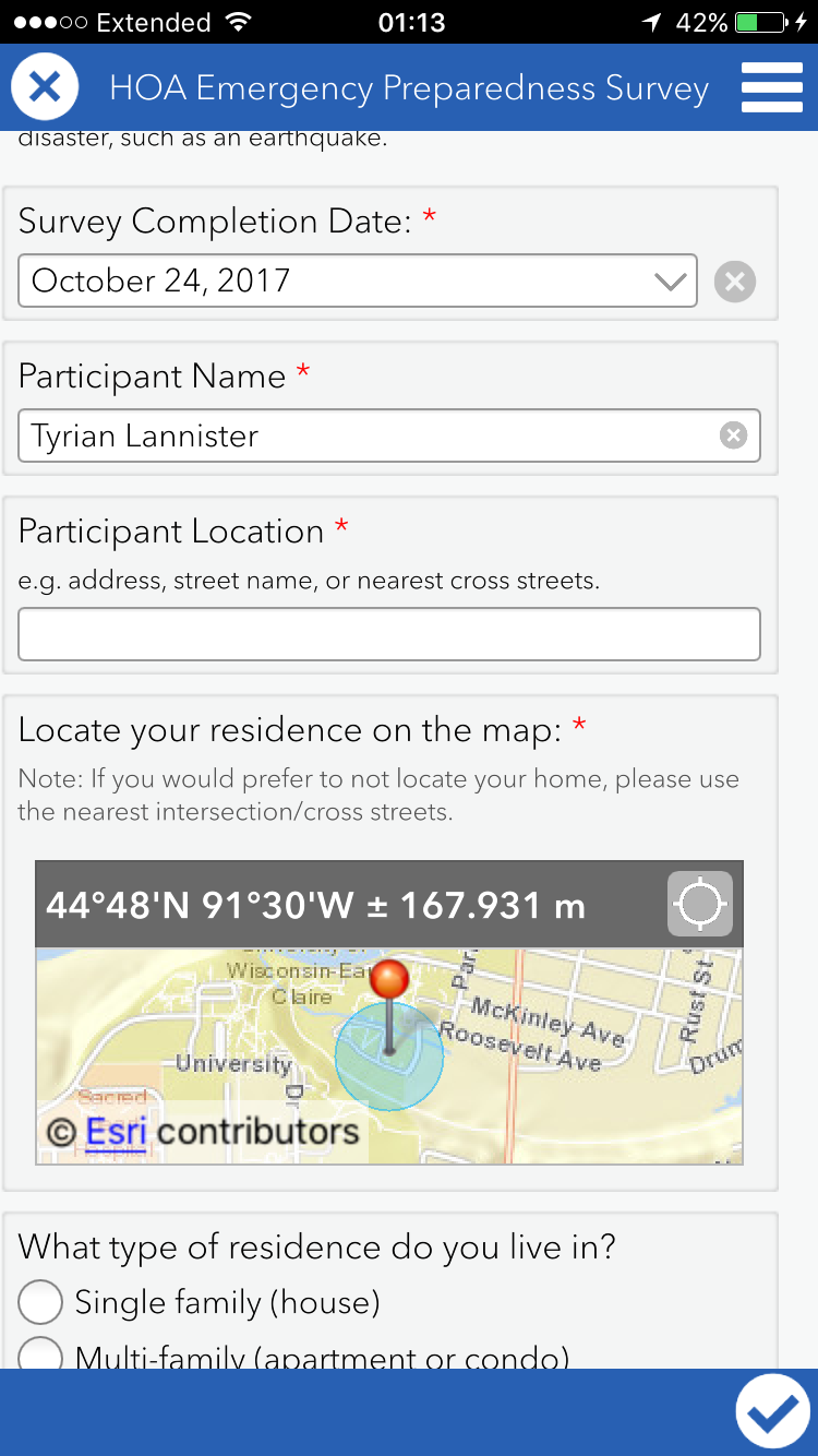
Figure 6 shows the survey on the mobile device

Figure 7 shows the three options after the survey is completed
Analyze Survey Data:

Now that the data is collected, it is time to analyze the data by reviewing the results of the submitted surveys.


Analyze reports

Go to My Surveys to click on the survey. The overview tab will show the total records, participants, and when the data of submission.

Figure 8 shows the overview results

The analyze tab on the other hand shows the stats of each participant's answers as well as each question (Figures 9) . Depending on the question, you can see the results on a column graph (Figure 10), bar graph, pie graph, and even on a map (Figure 11). By clicking Set Visibility under the view settings box, you can choose which question answers can be viewed.

Figure 9 shows the results of when each survey was submitted

Figure 10 shows a bar graph of one of the questions as well as the percentage each occurs.
 Each question had a bar graph similar to the this one varying on the amount of choices per question.

Figure 11 shows the map view of the question answers.

Display individual survey responses

The data tab will show all the results on an interactive map (Figure 12). The table below that shows all of the responses collected during the survey for each participant. If you can click on specific survey, it allows easier access to the results, and shows the house image. You can also export any of the data in a CSV, shapefile, or file geodatabase.
Figure 12 shows the location of each participant, and the survey results for each participant.
By choosing map viewer, one can get higher quality visual survey results on the web map. For example, you can see a heat map shown in Figure 13.
Figure 13 shows the heat map of the survey. The areas that are more yellow show
a higher concentration of completed surveys, whereas the areas that are more blue
show lower concentration.


Share Your Survey Data

Now that you have formed a survey, got results, and analyzed the results, the next step is to share those results. By using a configurable template on ArcGIS online, you will be able to make a web app displaying the survey results with map pop-ups.

Create a map with custom pop-ups

To create a web map displaying the survey data, open map viewer. In the contents pane, click Configure Pop-up, display A custom attribute display, and configure attributes.  Make sure all questions are on display and are unable to be edited then hit okay. The pop-ups will show up when you choose a location that a survey was taken at (Figure 14). Save the map as told in the tutorial.

Figure 14 displays a pop-up window for one of the survey results

Create a web app

The last step is to click the Share button in the map viewer, and click Create a Web App. In this lesson the the web app will have a configurable template with a basic viewer. Then change the settings and display according to the tutorial.

Figure 15 shows the final web app


Conclusion:

The final online interactive map can be accessed at:
https://learn.arcgis.com/en/projects/get-started-with-survey123/lessons/create-a-survey.htm

The maps shows that the highest concentration of survey results are in the Midwest area, specifically the Eau Claire area. However their were a couple outliers in Texas and Montana. Survey123 makes it easy to see these data patterns. 50 percent of households were single family (house). Most of the houses were built in around 14 years apart varying from 1945 to 2013. 5 of the houses had a resident of 18-60 years old. 66 percent of houses had Televisions secured, but only 33 percent had the computers secured. Overall for the safety checks more households had yes than no on all except safety check #9. Only half of the houses had a current evacuation plan.

Survey123 is a great application, and considerably applicable to almost anything. By conducting more and more experiments like these it will be easier to prevent mistakes and hazards for houses in the future. Almost all the results can be shown on a graph or a map which makes it easy to decipher. As far as crowd surfing household preparedness for natural disasters, the application couldn't get much better. One of the few flaws is the public access to people's personal information.

References:

https://learn.arcgis.com/en/projects/get-started-with-survey123/lessons/create-a-survey.htm